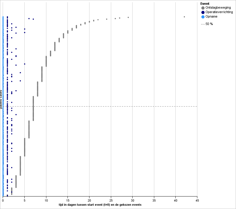
Each horizontal line is 1 specific patientcase.
Each coloured dot represents one event (admission, surgery, discharge)
Along the y-axis where x=0 you can find each individual patientcase.
The x-axis represents the duration in time as from the start-event.
The graph shows us that most of the surgeries are taking place within one day of the admission. Is also shows that more than half of the population stays 7 days or more in the hospital. There are a few patientcases with a duration of 20 days or longer.
Using a scatterplot it is simple to visualize the process times of a certain process. The most important clue is to plot the patientcases on the y-axis by giving them a number using a rank-formula. After that you can calculate the time between the starting event (admission) and the other events (surgery, discharge).
Using your imagination it is possible to make an interactive report (for example with Cognos Reports) in which the user can choose the starting event and the other events that must be plotted in the graph.
You can also add filters like gender, age, diagnosis, location etc.

Hopefully this post is helpfull, if not you can always contact me!
Daan Blinde
Geen opmerkingen:
Een reactie posten